Designing Tools for Learners (Not Users)

We (Catherine and Rahul) just co-authored an article in the Journal of Community Informatics called Design Principles, Tools and Activities for Data Literacy Learners. In it, we make the case that most tools that help people work with data prioritize flashy visualizations and outputs rather than helping to scaffold a learning process. This ends up making the process of data analysis like a black box (especially for people from non-technical backgrounds). We pose the question – what would it be like if we designed tools for learners rather than users? We offer four qualities that a tool designed for learners should aspire to be: focusedguidedinviting, and expandable and we go on to talk about DataBasic as a case study. Here are the four qualities:
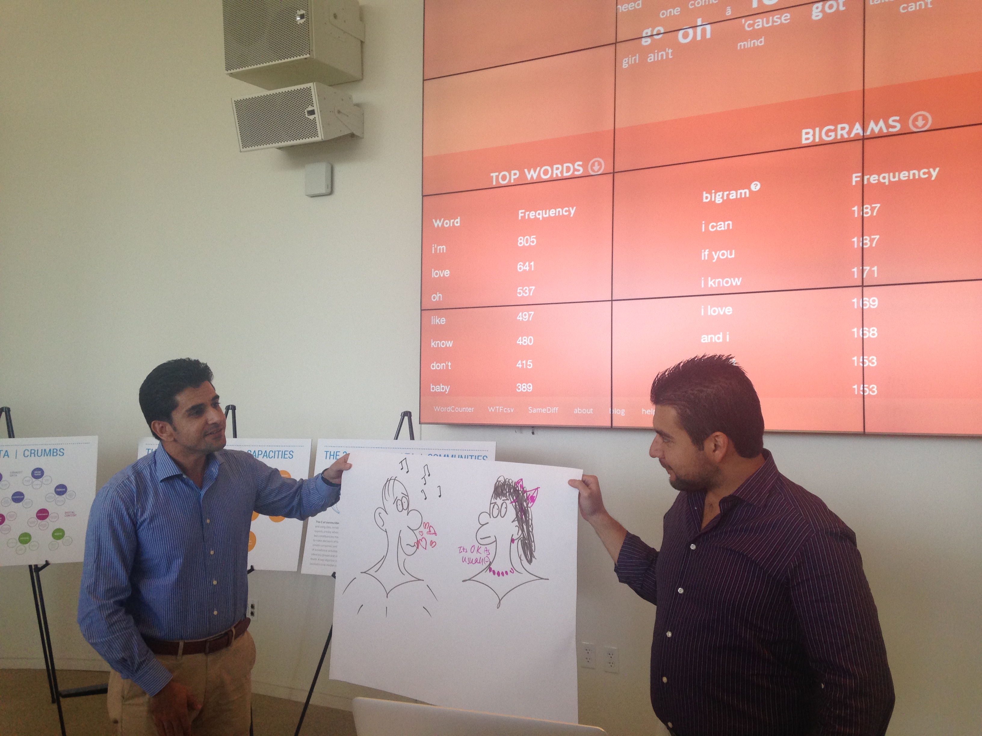
focused tool strives to do one thing well.  These tools are easily learnable and relatively constrained.  Focused tools do not provide many types of options, and thus can provide a low entry point for data literacy learners.  They create a small playground that is rich enough for the learner to play within, but not so rich that they get lost.

guided tool is introduced with strong activities to get the learner started.  Blank-slate websites and software packages require novice users to imagine usage scenarios.  Guided tools combat this by introducing themselves with an activity that holds the learner’s hand as they get started.  These tools might immediately present an on-ramp for learners via example data and example outputs.

An inviting tool is introduced in a way that is appealing to the learner. This might involve using data on a topic that is relevant or meaningful to them, or simply using humor and playfulness to invite the learner to experiment.  Inviting tools make conscious decisions about visual design, user interface and copywriting to offer a consistent, appealing, and non-intimidating invitation to the learner. Inviting activities use familiar materials to produce playful outputs that attract interest and excitement from learners.

An expandable tool is appropriate for the learner’s abilities, but also offers them paths to deeper learning (perhaps by leaving the tool and graduating to more complicated tools).  They overcome a single-minded focus by including call-outs and capabilities that allow the learner an opportunity and pathway to learn more about how the tool works.  Expandable tools recognize that they are steps along the path to building stronger data literacy for the learner, and help bridge from previous work to next steps.

Check out the full paper here. It is part of a special issue on data literacy published by the Journal of Community Informatics.


Workshopping a New Tool

DataBasic is constantly developing, driven by the needs we see in the communities around us; and our ability to get funding to support development and testing.  Over the summer we’ve been designing and developing a new tool we’re calling “Connect the Dots“.  The goal is to help introduce the language and approach of network analysis, and how it can let you ask different kinds of questions.

Since we don’t build new tools in isolation, we brought together a bunch of educators, journalists, students, visualization folks, and designers to give us feedback on our first design.  Here’s a “behind the scenes” video of that first workshop, where we tried out the technology and the activity.

Looks like fun, doesn’t it? So keep your eyes peeled – we expect to launch Connect the Dots as the latest member of the DataBasic suite later this fall!

Workshop at the Data Literacy Conference

We hosted a “Making Data Fun with an Arts-Based Approach” workshop for attendees at the Data Literacy Conference on making data fun using an arts-based approach. Participants used WTFcsv and WordCounter to learn how to ask questions and sketch out a story.  The audience included government agencies, journalists, educators, and others.  This diversity generated a really good conversation about how the could use these tools and approaches in their own work.

One of the groups made a fun image about how when they looked at a heavy metal band’s lyrics with Wordcounter, they found them to be much more lovey-dovey than they had expected!

Here’s the abstract describing the workshop:

Looking for creative ways to present data, empower community, and create art? We will share hands-on techniques for bringing people together to find and tell stories with data. Our activities can help you run workshops that lead a group through finding stories in data, picking a story to tell, and sketching or building something to tell that story. You will walk away with skills to facilitate capacity building and critical data literacy activities with youth and adults.

Big Data and Development at the MIT Media Lab

We conducted a workshop as part of the Data-Pop Alliance’s Global Professional Training Program on Big Data and Development at the MIT Media Lab. Data-Pop’s program focuses on building capacity for working with data for global professionals who are involved in development work and policymaking. You can read more about their approach here. In attendance were around 30 folks from universities, the civil sector, and government from a variety of countries, including Colombia, Senegal, France and the US.

Our workshop was titled Big, small, and popular data: engaging communities with data. First, we did a group critique of an infographic about global food production. This followed the structure of DataTherapy’s Activity: Critique a Gallery of Visualizations where we explored the story’s message, the audience and the visual techniques they used to tell a data-driven story. We then showed a basic process for working with data and gave some examples of how you can build in stakeholder participation at every stage of the process. The GoBoston2030 public engagement process run by the City of Boston for their transportation master planning process is a great example of this in government. They did community data analysis and interpretation events in order to make meaning out of thousands of qualitative data stories that they collected from citizens.

Finally, we presented the basic design goals of Databasic and participants worked in groups to tell a story from quantitative text data using WordCounter and to ask questions of a spreadsheet using WTFcsv. Groups came up with compelling ways to tell stories about their data in less than ten minutes. We had circle diagrams, sophisticated Simpsons’ cartooning and compelling concepts. We followed the workshop with Q & A about how to take simple, participatory methods back to their contexts.


DataBasic at Boston Civic Media

Rahul recently led a short workshop on DataBasic at the Boston Civic Media annual meeting.  The 1 hour hands-on session focused on how to use the arts to tell your civic data story.

Curious about how to use the arts to tell your civic data story? Wondering how to use the arts to help learn how to work with data?  We will introduce DataBasic.io: a suite of free easy-to-use web tools for beginners that introduce how to work with data through arts-based activities.  Finding and telling data-driven stories can help you streamline operations, spread your message, and bring people together for creative activities.  You’ll walk away with new skills for yourself, fun techniques for helping others learning to work with data, and inspirations for how to combine civic data and the arts.

IMG_3542

Participants used WordCounter to try sketching out stories based on lyrics from popular musicians.

The workshop brought together a diverse set of people interested in using the arts to engage people with data.  Reaching these non-traditional consumers of data is super important to us, so it was a joy to be able to engage with them.

Our round-up of Databasic workshops and demos from Spring 2016

This has been an eventful spring for Databasic! After launching in January to great success we have been traveling to classes, conferences and workshops to help different groups of people learn about working with data.

Catherine led four workshops for graduate and undergraduate Journalism students at Emerson College. Journalism students learned how to work with qualitative and quantitative datasets from open data portals and start telling stories. Rahul led a workshop for his Data Storytelling Studio class at MIT. Students studying art and civic engagement at Emerson College used Databasic to analyze citizen ideas for the future of transportation in Boston which they later presented to guests from the City of Boston and State of MA.

Rahul led a workshop for a coalition of organizations that work with the youth in the arts sector.  It was an exciting chance to share how the DataBasic approach can help arts organizations think about telling stories of their impact with the rich qualitative and quantitative data they have.  The group loved WTFcsv’s visual approach to finding stories.

The Institute for Infinitely Small Things, a public art group, used Databasic as part of their project Campaign Limericks where they worked with students and community members to create limericks out of the top phrases spoken by presidential candidates. Want to check out our corpus of candidates speeches? There are over 100K words for Trump, Clinton, Cruz and Bernie. Catherine and the Institute later created an art installation and data visualization of four limericks at the Harvard Center for American Political Studies.

Four large limerick visualizations created from Databasic analysis are up at the Harvard Center for American Politics in Cambridge thru August 2016.

In April, Rahul shared Databasic as a tool for participatory data analysis at TICTec 2016 in Barcelona. Organized by mySociety, the conference showcased many different technologies and methods for evaluating the impact of Civic technologies for people from 20+ countries. Here are some tweets from his presentation:


Catherine spoke about Data & Community Engagement at the White House and demo’d Databasic to 150+ people in law enforcement and technology at the White House’s celebration of one year of the Police Data Initiative. More than 53 police departments across the country have signed on to opening up their data in the next year. The event was inspiring and showcased law enforcement departments like Dallas and Orlando who are at the cutting edge of transparency and community engagement.

Also, Catherine got to take a photograph with USCTO Megan Smith which was kind of awesome:

And in early May, Catherine ran a Data Storytelling 101 workshop for journalists on the education beat at the Education Writers Association conference. We worked with data from the Chicago Public School system on student suspensions and started asking questions about race and school ratings in conjunction with suspensions. We also spent a good portion of our time talking about cleaning and merging data.

The spring wrapped up with a workshop for 50 municipal government workers participating in the CityAccelerator project organized by Living Cities and facilitated by Eric Gordon and the Engagement Lab in New Orleans. Teams from Seattle, Albuquerque, Baltimore, Atlanta and New Orleans worked on analyzing citizen comments with WordCounter and spreadsheets related to their accelerator projects with WTFcsv. We also brainstormed other datasets internal to their organizations that they might use with Databasic.


We are thrilled at the reception up to this point and have learned a lot from our participants’ ideas about how they can use Databasic in the context of journalism, media literacy, the arts, community engagement and local government.

v1.2.0: New Features and Bug Fixes

We just released a new version of DataBasic – version 1.2.0!  Yeah, it doesn’t sound that exciting but trust us, there is some good stuff here 🙂

The highlights:

  • CSV parsing is now much more robust
  • We’ve added the idea of “normalization” to SameDiff
  • We cleaned up some of our sample data
  • We sped up everything
  • We show you when your results are going to expire soon (they last for 60 days and then we delete them)

You can browse our GitHub Issue tracker to see all the bug fixes in this release.

Go try it out now at databasic.io!

Learning with the Knight Foundation

DataBasic’s development was generously supported by a grant from the Knight Foundation’s Prototype Fund.  The key hypothesis they funded us to test? That building online tools for working with data for learners is different than building for users. While the output is available here at databasic.io, sadly our grant has ended 🙁  We wanted to take this opportunity to share some of our experience from the close-out event Knight just hosted with Maya Design.

Wrap-Up and Reflection

The event began with some scaffolded reflection on the 6-month grant cycle.  We spoke with other grantees in small groups about goals, pivots, successes, failures, learnings, and next steps.  Many sticky notes were used!

IMG_2379

One aspect of the event was the amazing set of short 5 minute talks describing the wide variety of projects.  Here’s Rahul speaking about what we’ve learned so far:

The key here was the focus on learnings.  All these small projects Knight funded create an aggregate picture of learnings from prototyping, a methodology we deeply believe in.

Outreach

With prototypes built, how do you get folks to use them? Our approach with DataBasic involved our audiences in the development of the tools, via multiple workshops, so we had investment from them already.  The focus of this Knight event was to explore the answer to this question more, to help grantees refocus on outreach and marketing.

The folks from Maya led us in an exploration of stakeholders, their needs, and the benefits we provide.  While we had done much of that thinking before, formalizing it on paper was incredibly helpful to think about holes in the outreach we are doing post-launch.

Then they led some great hands-on exercises to help develop elevator pitches from a template.  Here’s one we wrote about why DataBasic is useful for community activists:

For community activists, who need friendlier tools that help them learn how to work with data, DataBasic.io is a suite of online tools for working with data that provide playful and focused, on- and off-screen activities unlike other online tools for finding stories in data, because we have designed and built them with and for learners.

These pitches are a great way to clearly describe what your project brings to its intended audiences, even if you have already thought about it a ton.

Next Steps

As we’ve written before, this type of work is more like a marathon than a sprint.  While we are excited about the enthusiastic response after our launch, we realize that we have to pay close attention to feedback from our various audiences to keep iterating.  We of course hope DataBasic can be useful tools and activities, but we also want it to evolve into a model for how to build data-centric tools for the huge population of learners starting to work with data.  Many thanks to Knight for helping us start down this road, and we look forward to getting their, and your, feedback!


One Week of DataBasic.io

We launched DataBasic.io just one week ago and would love to share some of how our first week went.  More than 4000 people tried out DataBasic.io in just our first week 🙂

Some Press

First up, we got some great press online; from Matt Carroll’s review, to the MIT Media Lab to the UN in Jakarta!

That really helped drive some attention and traffic, and spread the message to folks that we otherwise aren’t connected to!

Some Stats

As we mentioned earlier, more than 4000 visited the site.  That’s great, but we really care about what they did when they were there.  Here are some stats we were excited about:

  • More than 1000 people watched our introductory videos.  This is great, because that’s one of the ways we are trying to make this type of stuff fun and not-intimidating.  Watch them all on our DataBasic Vimeo channel.
  • More than 1/3 of the people who came to one of our tools actually used it to analyze some data.  In the world of web analytics this counts as one of our main “conversion” rates – how many people did the thing we want them to.  This is really high! Most people looked at the sample data for about the Titanic survivors.
  • Almost 50% of visitors rolled over a technical term and read a popup defining what it means.  We are hyper focused on people as learners, and it is great to see this learning feature being used so much.
  • Over 200 people downloaded our activity guides.  One of our core goals is to make these fun activities easier for other people to run, so this is great news to us.  Check out the activity guides for WordCounter, SameDiff, and WTFcsv.

That’s just a quick summary of the impact and use we are seeing so far.  Definitely a success so far!

What’s Next?

These types of projects are much more like marathons than sprints, so as people start to use our DataBasic tools in the real world we look forward to learning more from their feedback.  For instance, we’ve already had a number of suggestions, and an offer to translate in Hungarian.  We’ve also secured funding to add another tool to the suite. Let us know how these tools work for you, and send in any ideas you have about them.

Announcing DataBasic.io!

DataBasic.io is live!!!  After 6 months of planning, building, trying things out with folks, and rebuilding, we’re open to the public 🙂

We’ve got three tools for you to start playing with – WTFcsv, WordCounter, and SameDiff.  Pop on over to https://databasic.io and give them a try.  Right now we’re supporting Spanish or English, and it is accessible to visually impaired via screen-readering software.

Don’t forget to watch the short intro videos on each homepage, and check out the activity guides.

Big thanks to the Emerson Engagement Lab team for helping us get these done – specifically Jay and Jordan!  And of course this wouldn’t have been possible without the support of our sponsor, the amazing Knight Foundation.